Bar charts are common in technical work (both writing and presenting). When done well, even the simplest bar chart can house a staggering amount of information; thus, designing your bar charts carefully is essential.
Bar charts are useful when you only have to show a few independent variables. Bar charts often represent collected quantitative information. In documents, they should have good captions. In presentations, use the notes pane to house those caption-like elements.
Basic rules:
- Start and label each axis at 0.
- Define and show units clearly.
- Represent a manageable set of information. Too many bars will overwhelm any audience. Think about grouping several small elements into one larger category to simplify.
- Design easy-to-decipher charts. Bar charts usually plot just two variables (the X- or Y-axis). The X-axis is usually the known value (such as time) and the Y-axis is the unknown.
- Construct bars that display difference. If the scale impedes understanding, rescale.
- Insert spacing at 1:1.5 scale between the data groupings. (Note: Most software that creates bar charts will do this automatically.)
- Streamline the unpacking of the chart by labeling large bars inside the bar, if legible. Use a legend if this labeling become too cluttered.
- Print out the bar chart in black and white as a test. Also consider issues for color-blind readers/users.
- Avoid chartjunk, including 3D elements. Decorating your charts distorts rather than illuminates your data. We recommend that even the grid lines be minimized too.
Specific advice for bar charts in presentations:
- Keep it simple. Charts can quickly overwhelm an audience in a quick-moving talk.
- Layer in your bar chart during the presentation, bar by bar, at the moment you need it. The animation feature allows for such practice. By bringing in data groups only when needed, you will help the audience’s comprehension of the topic.
- Use the notes pane to explain the significance of the graph in order for your slide deck to have archival/legacy value. Do not assume that your reader will come to the same conclusion as you did with your graphic. There’s more on this in Chapter 10 of Slide Rules.
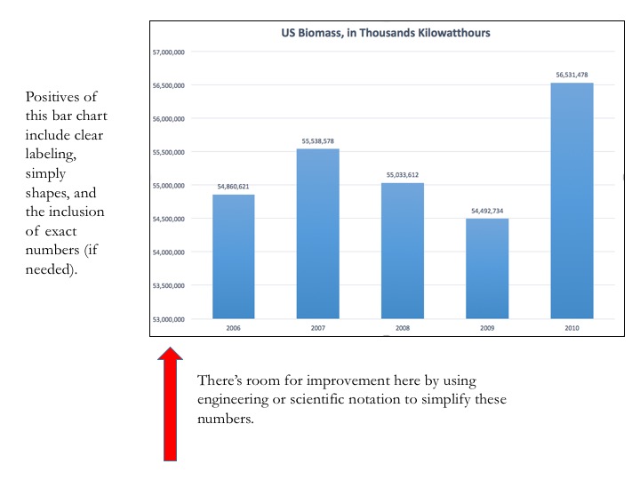
Here is a bar chart example, with a few notes for your consideration.