Contents
Visuals as Islands of Information
Technical visuals are islands of information; we need to treat them as the rich resource that they are. While a good, clear visual is essential, the caption can truly help readers interpret essential information within that visual. Some technical experts are quite adept at writing helpful captions, and their work is all the stronger because of the care that they take in writing their captions.
Elements of a Great Caption
- A Label. For most visuals, this will be Figure or Fig. with a number following that corresponds to the visual’s placement in the document. Use either “Figure” or “Fig.” consistently throughout. For Tables, label those with Table and a corresponding number. The use of a Label is required.
- A Title. This is usually a fragment/phrasal piece. Name the visual. Each visual should have a Title.
- A good, interpretive, informative Caption. Write these in complete sentences, and do not be afraid to use the space for interpretation, analysis, and so forth.
- A Citation (if appropriate). If the visual is taken or created from another source, then it should be cited.
Poor Captions
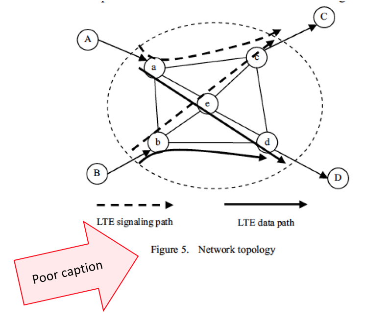
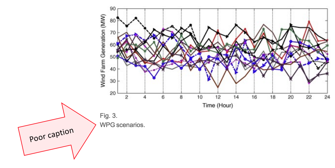
Too many technical and engineering writers make the mistake of thinking the caption is just label. Below are two example of this less-than-optimal practice. Sadly, this format is so common that people think it’s the “right” way. In fact, it’s an opportunity lost.
Great Captions
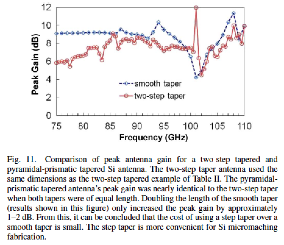
The next example is taken from an IEEE article [1], and it shows how an informative caption can be a value-added proposition. Note that the caption interprets the visual, which allows the reader to see the data and understand its complex meaning by the authoring experts.
We can see how the full caption written by these authors certainly provides a rich, full description of not only the data factors but also how they are being interpreted by the authoring team. Such captions leave little room for misinterpretation by the reader, which is always good.
Poor to Great Caption Transformation and Discussion
Let’s walk through and example and answer some questions that people usually have when thinking about captions.
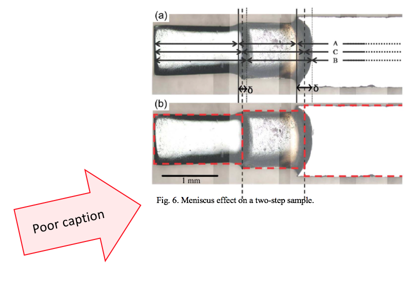
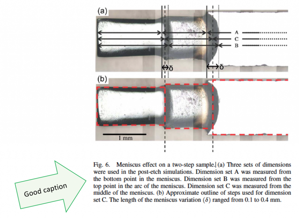
We will begin with a typical poor practice. This example below was mocked up using a visual. Notice how the caption only has the Label (Fig. 6) and the Title (Meniscus effect on a two-step sample). The caption itself is missing!
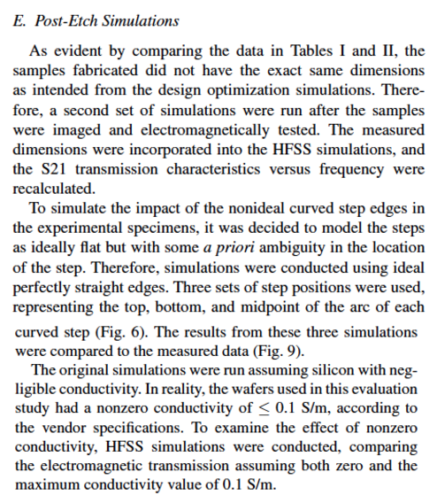
However, in the original article [1], the brilliant authors provide a great caption that shares essential information. Let’s look at it:
This is a truly great caption that communicates technical work. Is it long? Yes. Is it effective? Yes. As well, it offers information that is not found elsewhere in the article. Great captions are specific to the visual and offer interpretation and technical details not found elsewhere in the write-up. Great captioning is a strong companion to the longer article. Below, you can see how the description in the journal article [1] appears. When comparing the two, it becomes apparent how they compliment each other (not repeat each other).
Formatting Captions
Generally speaking, for written work, there is no rule about the formatting of captions. The caption should not be in the exact same font as the article or report. It needs to visually stand apart. This is accomplished in many ways; the key is consistency. Whatever style you sue, do it the same throughout. Several variations on how to design captions are below.
Different Font Style
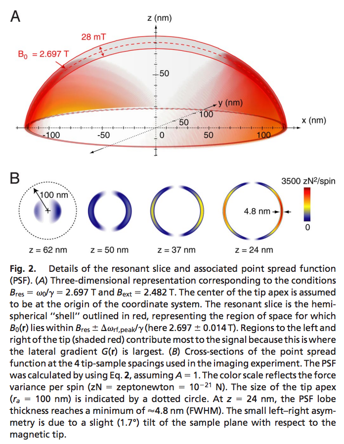
Captions can be set apart visually by simply changing the font style. For example, if the body of the report is written in Times New Roman, choose a sans-serif font (like Arial) for the captioning. Below is a nice example [3], and you should also notice the incredibly strong caption content, too.
Bold Font
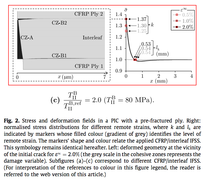
The simple use of bold can be applied to the Label and also the Title to help set the caption apart from the rest of the report or article. In this publication [4] , the use of bold is used just for the Label. (Notice, too, the incredibly strong caption work. As well, the writer directs any readers who are seeing a black-and-write printout to refer to the colorized web version of the graphic for full detail.)
Same Font Smaller
One method to design captions is to use a font size one or two sizes smaller than for the report itself. This example from [4-SUNG] shows that practice, wherein the caption was in 9pt font and the article was printed in 11pt font. The Label is abbreviated to “Fig.” and the Title is not set apart in any significant way. This is the least desirable design, as it can be easily confused with the regular paragraphs on the article, visually. Content-wise, the caption is short but does its work.
Captions in Action
If you would like to see how all of these elements work in a truly integrated manner, where the document, its visuals, its online presence, and even slides work together, examine the web presence of the Proceedings of the National Academy of Science, found at http://www.pnas.org/ . Truly, this organization has put into place a systematic method for readers to be able to read and use the visuals provided by authors. The practcies on that site show a visual set that includes not only the visual (with label, title, and full caption), but also downloadable and transferrable visual pieces.
If, as authors, technical specialists, researchers, and communicators we have a vested interest in full and complete understanding of our work by our readership, then we need to take the extra steps that allow for accurate interpretation and analysis of the visuals that we provide. Visuals are compelling to all readers, and it behooves us to deploy them with much care as the rest of our work.
References
[1] Marconnet, A.M., He, M. M., Sengele, S., Jo, S-J., Jiang, H, Ferrier, N.J., vanderWeide, D.W., Madhavan, V., Nelson, N., Booske, J.H. “Microfabricated silicon high-frequency waveguide couplers and antennas,” IEEE Transactions on Electron Devices, vol 56, no. 5, pp 721-729, May 2009.
[2] Sung, H.J., Badcock, R.A., Go, B.S., Park, M., Yu, I.K., and Jiang, Z. “Design of a 12-MW HTS wind power generator including a flux pump exciter,” IEEE Transactions on Applied Superconductivity, vol. 26, no. 3, April 2016.
[3] Degen, C.L., Poggio, M., Mamin, H.J., Rettner, C.T., Rugar, D., “Nanoscale magnetic resonance imaging,” Proceedings of the National Academy of Science, DOI: 10.1073.
[4] Grail, G., Pimenta, S., Silvestre, T.P., Robinson, P., “Exploring the potential of interleaving to delay catastropic failure in unidirectional composites under tensile loading, ” Composites Science and Technology, vol. 106, pp. 100-109.
Portions of this page were previously released by the IEEE Professional Communication Society via its newsletter. (ISSN 1539-3593, Volume 54, Number 3, March/April 2010. Author: Nathans-Kelly).
